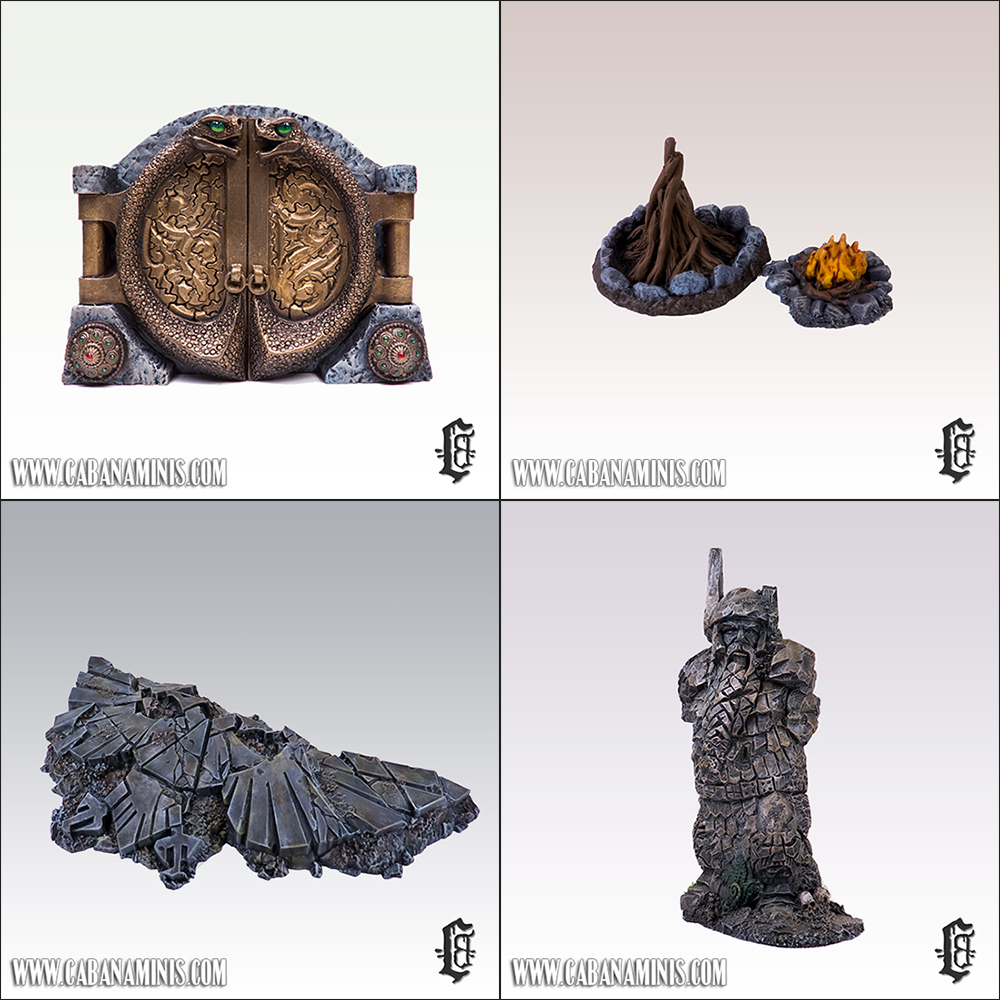
Cursed Treasure Set

I painted this awesome Treasure Set from Ristul’s Extraordinary Workshop. I love painting treasure sets and this set is very original and has lots of cool elements – So I actually ended up painting two of them in different color schemes (I’ll probably sell one of the sets at some point ;-)

You can purchase the Cursed Treasure Set here at King Games – Where we’ve also used the pictures above!

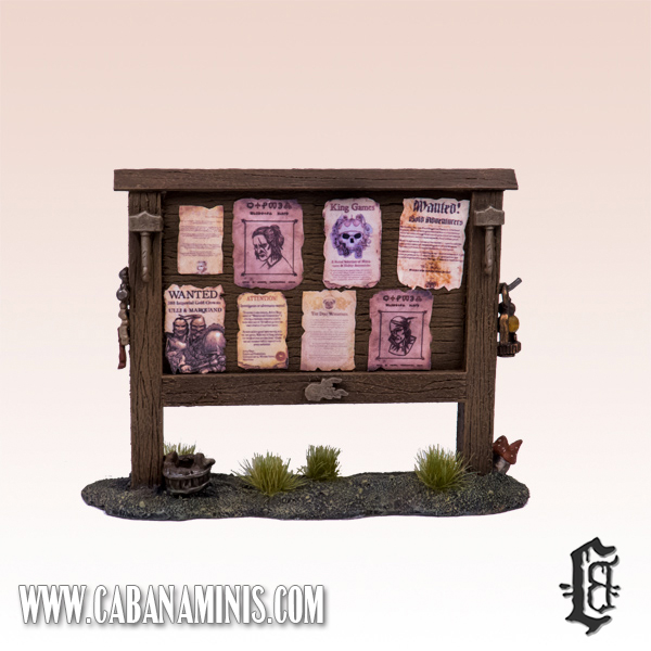
Notice Board!

One thing we have always used in our RPG’s but never had terrain for is a notice board! It is a very useful prop whether you are in a big city or a small village, ’cause you can always find a missing person note, an advertisement, a wanted poster or a help wanted notice! We couldn’t find any such thing anywhere, so we made one ourselves!

Notice Board

Using balsa and a bunch of accessories it ended up looking pretty cool! We printed out some of the posters we initially made for an advertising pillar (which I will add to the blog at some point!) Ulli and Marquand is loose in our Middeheim campaign so they were an obvious choice for a wanted poster along with other posters (handouts printed in mini-size) a notorious witcher + Scoia’tael leader, advertisement for an awesome shop called King Games, and a real cool handout from WFRP 1st edition (think it was a fan-made version. Thanks to whoever made it!)

UPDATE: I recently posted a link to the posters I used and some tips www.cabanaminis.com/posters-for-notice-board

Tabletop-World: Mansion

This is the wooping large Mansion from Tabletop-World. A really large building and the tallest house I own (not counting the watch tower or town gate) I added some of my warepiles to the picture for a little flavour and size comparison :)
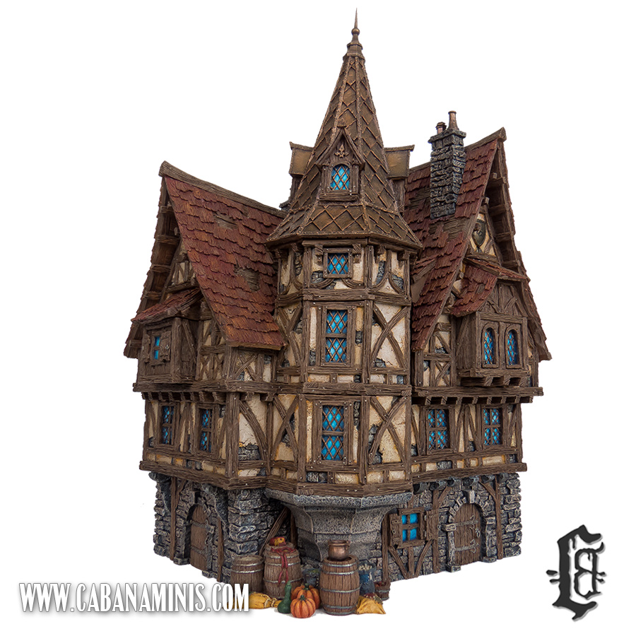
Tabletop-World Mansion
The building is in 3 floors with a huge roof and a cute spire. I did the unthinkable and glued every section together as I knew I would never actually use the interior of the building. The size is realistic but hardly any furniture I own except Tabletop-World’s own pieces fit inside, plus the building easily get worn down and chipping paint when continously being pulled apart.
Another reason for this is because I use it for RPG’s and Mordheim. When several people move the buildings with loose sections around, accidents are bound to happen as it is pretty unpredictable where the sections are combined to the different pieces. Only 2 of the Tabletop-World buildings I own have fully painted interior and so far never seen the light in any sessions.
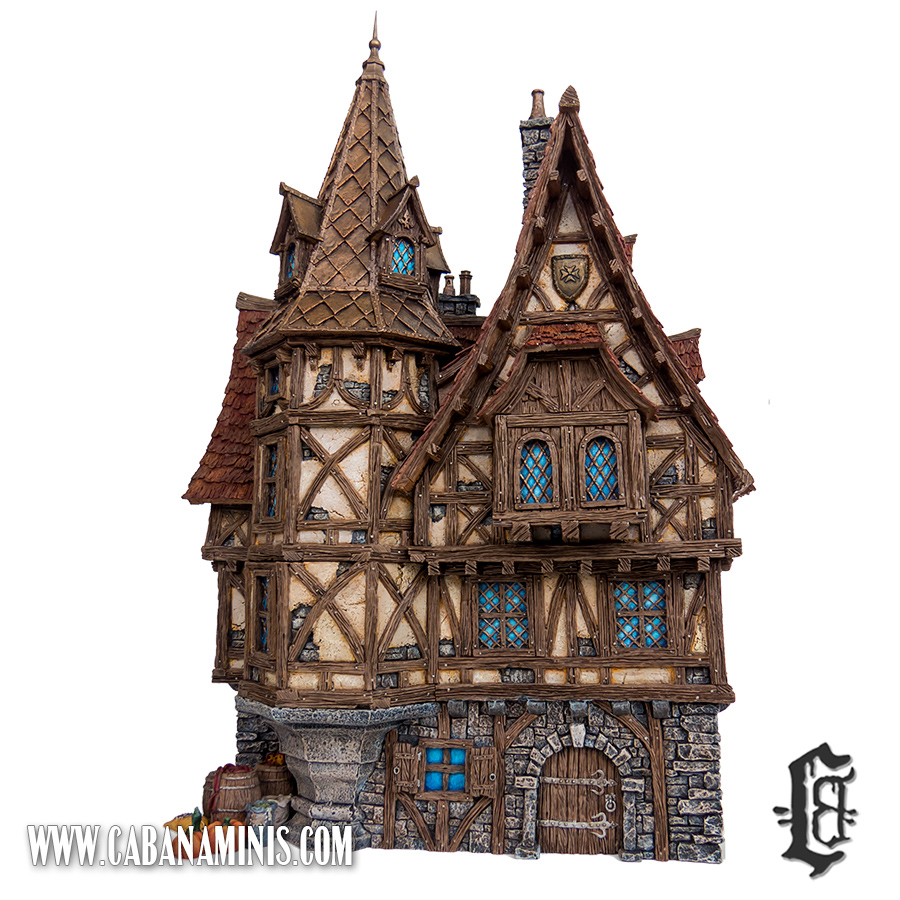
Tabletop-World Mansion 1

The spire bronze-roof is actually the only part of the paint job I am not 100% satisfied with. I think I would paint the bronze a bit darker next time as it blends in with the wood colours.

I didn’t glue the spire roof together for limited space reasons as it is quite a tall building. Unfortunately, the spire looks a bit crooked on the pictures. Most likely because it wasn’t adjusted properly that day.

I was quite happy with the rest of the building, although I absolutely dreaded painting all those windows. Never painted that many before! Atleast they turned out OK :-)

Still a really cool building and it looks awesome on the gaming table! :-D

Tabletop-World: Blacksmith Forge

This is the newest Blacksmith Forge from Tabletop-World. By newest I mean that this is actually their 3rd version of their blacksmith building. I am fortunate enough to own the 2nd edition aswell which is a whole lot different and much larger than this.

Tabletop-World Blacksmith

It was easily assembled (their new models are great!) and I’m glad I made my old Blacksmith (the 2nd edition) look more like a house or bakery as I wanted it to be up to each session which kind of building it resembled. Else there would be quite a competition in the village!

Tabletop-World: Cottage

This is the cottage from Tabletop World. Another of those newer buildings which require almost no assembly (which is a big plus for me as the old ones were a b#*@% to assemble)

This time I tried out a more cozy orange colour for the windows instead of the traditionally blue, which also looks really cool but a bit trivial. I was afraid that it would look like the house was on fire, but I think it turned out perfect! Added to the picture is the dead tree from their catalog and one of my many warepiles :)

I was actually inspired by a very old version of the Memory game from Ravensburger I had when I was a kid. One of the tokens were of a timbered house with orange windows and a black roof. Really spooky and I absolutely loved it! I am currently painting their “Townhouse III” in those colours and it will most likely stand out, but i’ve really enjoyed painting it so far!

Tabletop-World: Coaching Inn

This one is the Coaching Inn from Tabletop-World and at the time of purchase (2013), the largest house they ever made. In 2014 however, they made an even bigger Mansion and finally in 2015 they added the Town Gate which is enormous! Wonder how 2016 will look!

I actually painted this one twice because I thought it would look cool with red patterned stones instead of standard grey. Boy, was I wrong! The whole thing looked like a big mess! So I decided to start over and try again with the standard grey theme. Looked a lot better :) Also added some of my many warepiles for extra flavour!

Still it is a fragile building (especially the balcony railing, which miraculously survived the trip from Croatia) and I shiver every time one of my friends tries to use the balcony in Mordheim!

The Dead: The Plague Cart

Another piece done for my project “The Dead” which basically includes corpses, casualties etc.

This time it’s a Plague Cart – It’s basically the Corpse Cart from Games Workshop, without zombies pulling the cart and a necromancer commanding the zombies.
I decided to paint the corpses before gluing them onto the Cart. This turned out to be quite a problem and as a result a few of the corpses are “floating” a bit. Fortunately you don’t really notice it on the table.

The Plague Cart has already been used several times in the ongoing WFRP campaign I’m a part of. A strange plague has hit Middenheim and corpses are being piled up.

The Dead: The Hanged Man

Another piece done for my project “The Dead” which basically includes corpses, casualties etc.

This time it’s a converted piece called “The Hanged Man”, I used a pole from The Hobbit terrain piece “Goblin Town”. I then added a Games Workshop zombie hanging from a rope, a kind note from the Witch Hunters who hunted this heretic down, a crow eating a piece of rotting flesh from the ground and that’s more or less it.

The result ended up being an excellent terrain piece that can be used for many settings.